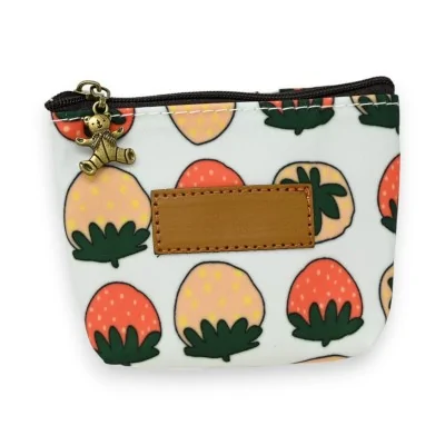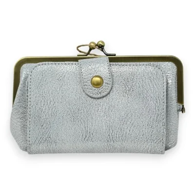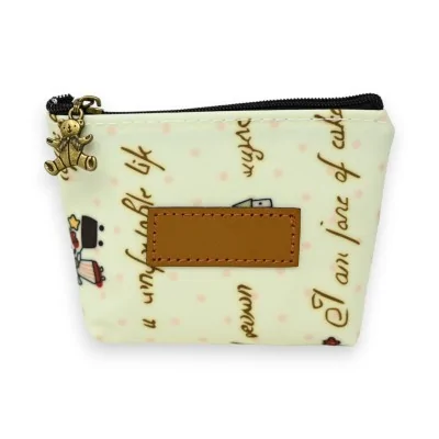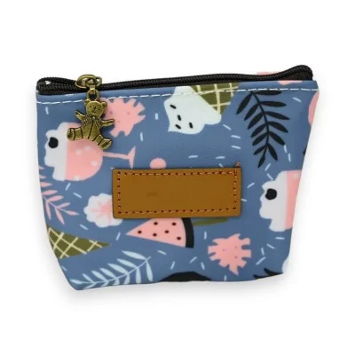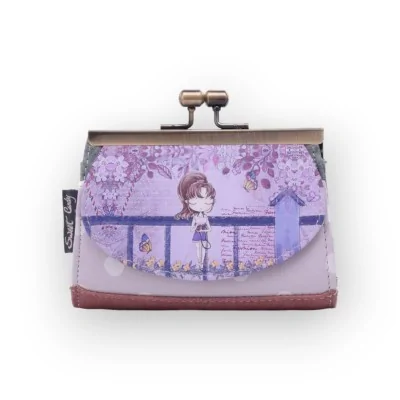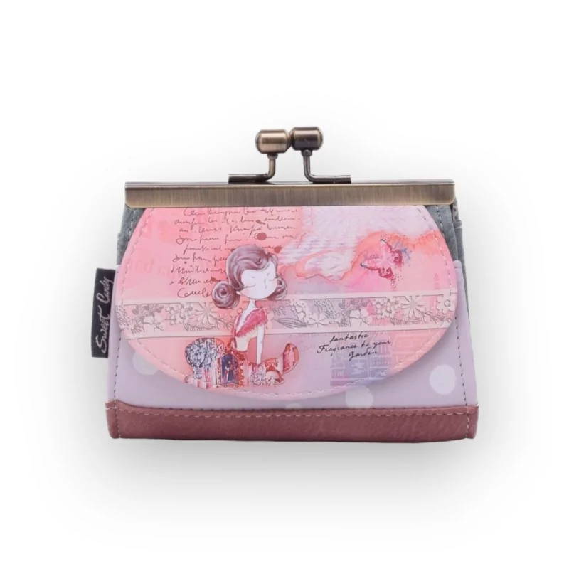
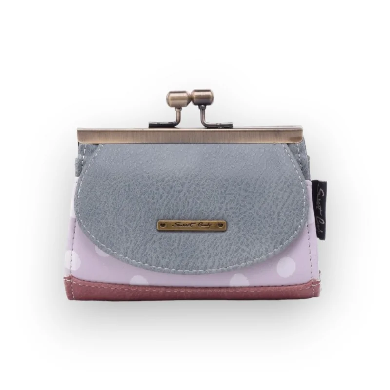



Most printed coin purses look the same from every angle. This one does not. The front flap carries a full illustration; the reverse drops the picture altogether and comes back grey from edge to edge and free of print, its one marking an engraved plate the size of a thumbnail. Held one way it is a picture; held the other way it passes for something quite sober. That matters more than it sounds when the purse comes out at a till or sits on a café table.
The girl on the flap wears her hair up and a coral top, and stands among flowers and building facades drawn in fine white lines. A coral butterfly crosses the top of the scene and pale handwriting fills the space behind her. Below the drawing runs a short line of English wording in cursive, small enough that you have to bring the purse close to read it. Coral and rose lead the palette, laid over off-white.
| Printed front | Garden scene, coral butterfly, cursive English lettering |
|---|---|
| Plain back | Grey throughout, one engraved plate at the centre |
| Body and base | Mauve ground under white spots, rose band at the foot, grey flanks |
| Metal and stitching | Two-ball clasp frame in a bronze finish, brand tab stitched to one side |
The frame swings the mouth wide in one movement, which is the point of this closure: you look in rather than dig about. The 3.5 cm of depth is what separates it from a flat pouch, and 13 cm across takes a single card lengthways without bending it. Ask it to carry a stack of cards and it stops being the right shape. You can weigh that up against the other sizes and closures on the shelf before deciding.
Coral and rose come forward against plain fabric, denim or ecru, and disappear against a busy print, which is exactly when you turn the purse round and let the grey face do the work. No two pieces in the range carry the same scene, and you will find them among the other printed designs in the same series.

Data sheet