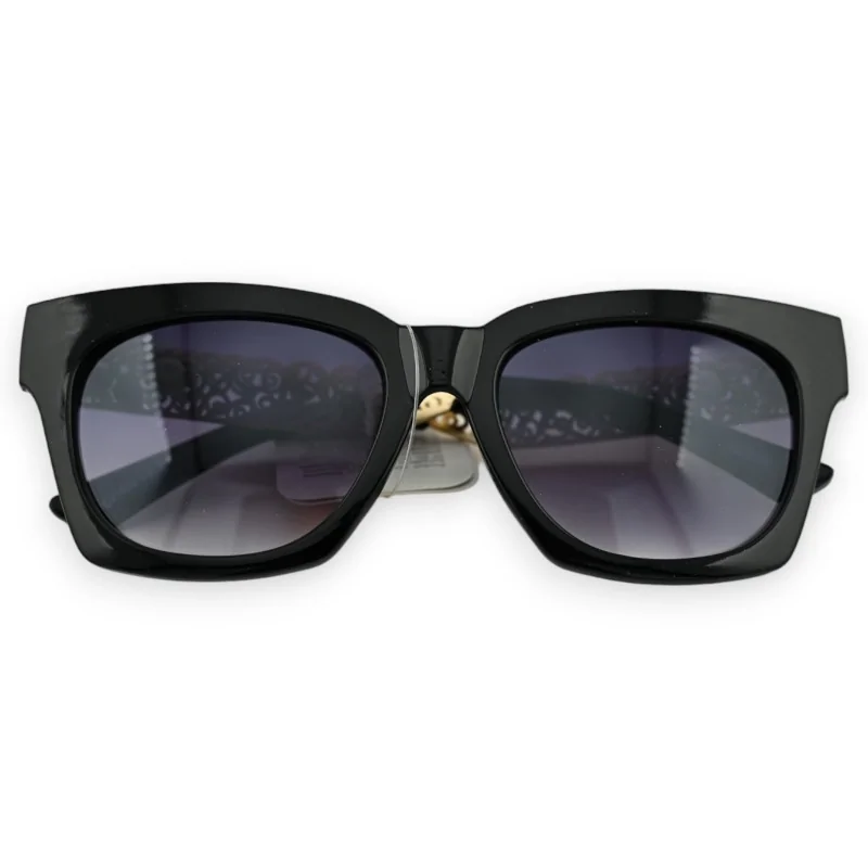



Hold this pair at arm's length and the lenses are what you read first. The tint runs deep grey-purple along the top and thins out towards the lower edge, so the upper rim looks heavier than it actually is.
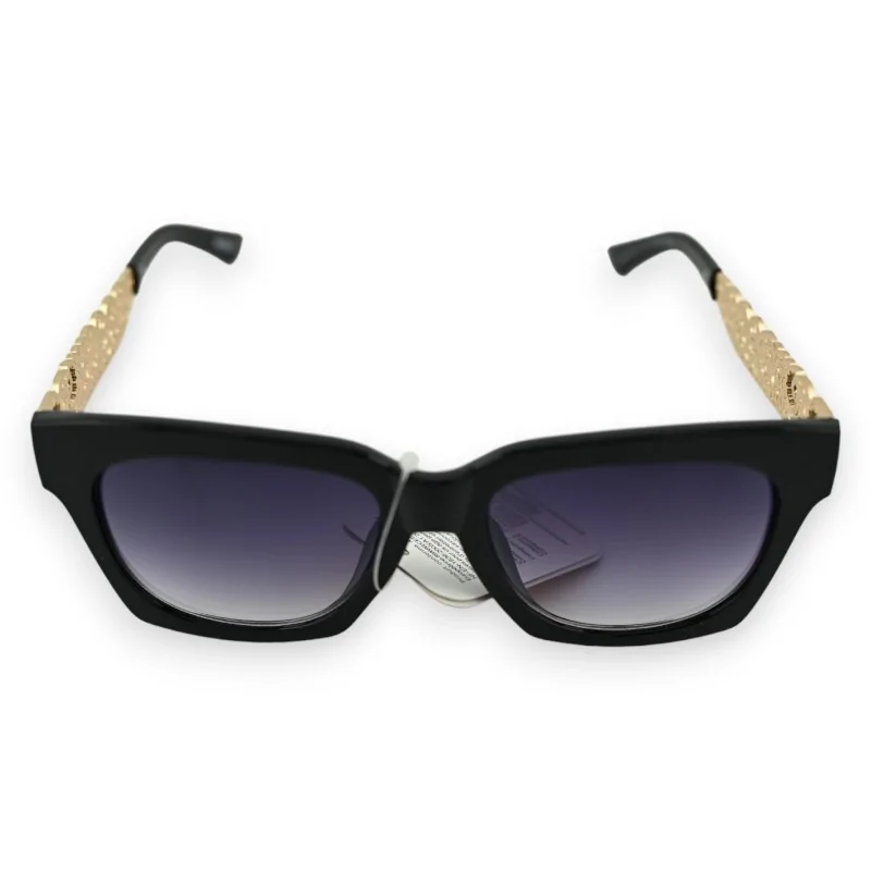
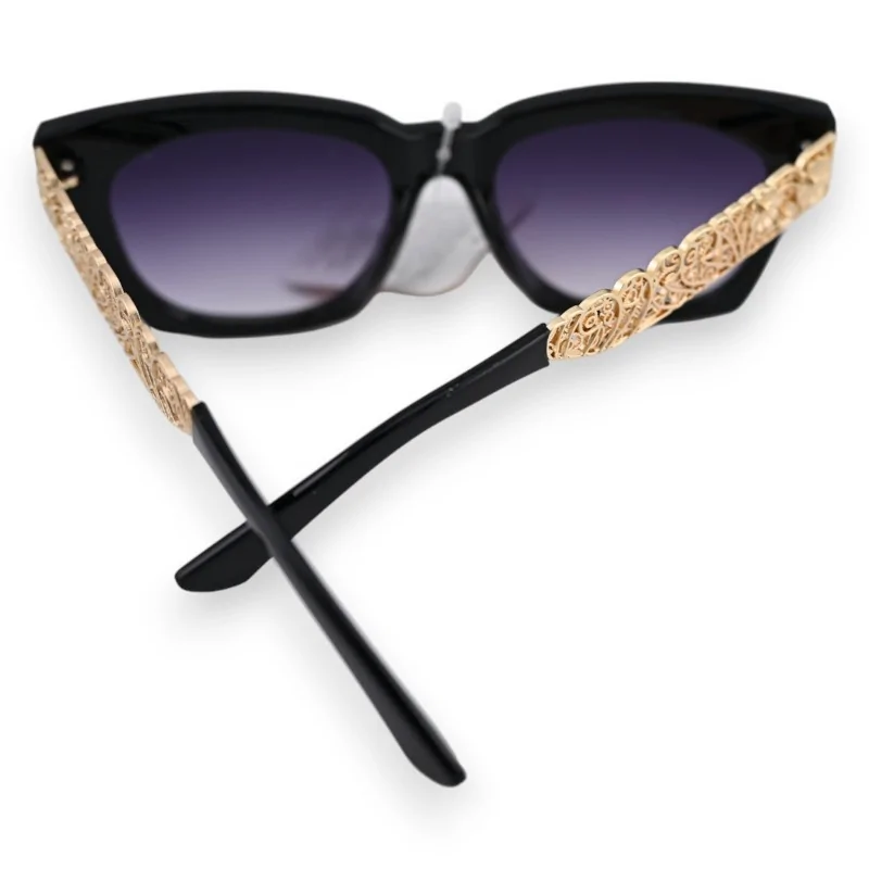
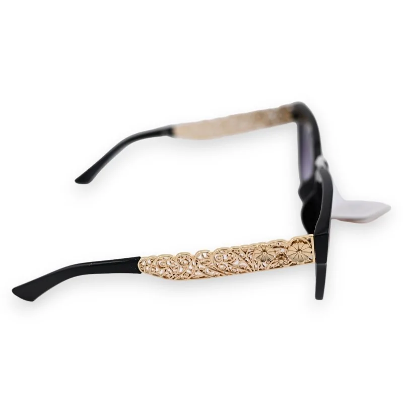
The front itself is a wide rectangle in glossy black, thick-rimmed, with outer corners that lift a little. Turn it sideways and a gold openwork panel appears on each temple, worked in scrolls and small rosettes, stopping short of the plain black tip.
Across a room, a graduated tint behaves nothing like a flat one. The top band is darkest, just under the brow line, and that is the part anyone facing you registers; further down the lens clears and the eye stays readable. The practical result is that this front looks broader and more sheltering at a distance than it does in the hand, an effect a single solid tint would flatten straight away.
Four photographs cover the pair from the front, from the side and from behind.
| Lenses | Graduated tint, deep grey-purple above, clearing towards the bottom. |
|---|---|
| Front | Wide rectangle, thick rim, glossy black, outer corners raised slightly. |
| Temples | Gold panel between hinge and tip, pierced rather than solid, scrolls and rosettes. |
| Tips | Black, curved, left undecorated, like the bridge. |
Straight on, the temples vanish behind the front and the gold never shows. It takes a three-quarter or profile angle for the panel to come into view, which is what makes it a private sort of detail: the people who notice it are standing beside you, not opposite. Useful to know before you look at which other pairs keep their pattern on the temple.
One caveat on pairing: gold jewellery tends to compete here rather than echo, so keep it thin, or borrow from the scarves and brooches on the next shelf instead. A single stud and a bare wrist leave the temple to do the talking, which is roughly what it was designed for.
Data sheet