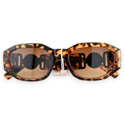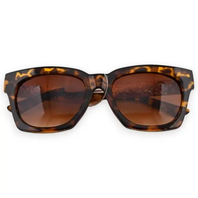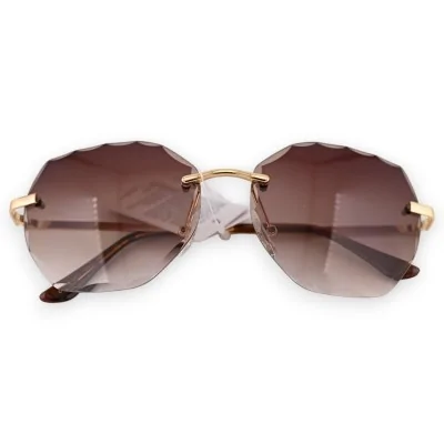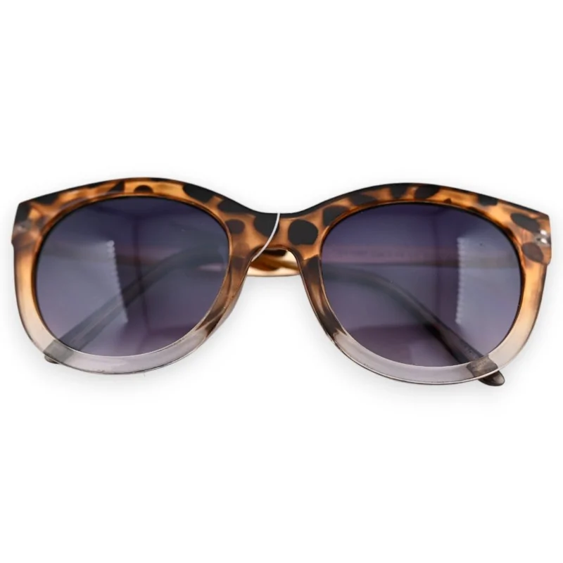
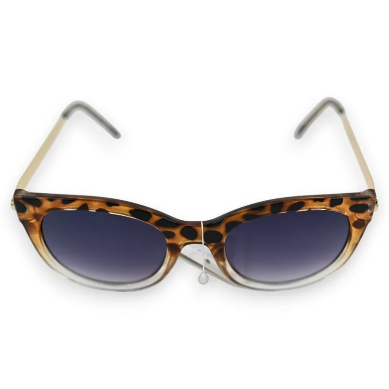
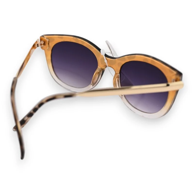



Hold this pair up to the light and you see what it is doing: the top of the front is tawny with dark spots, the bottom is clear enough to see the arm through it. The lenses fade in the same direction, deep at the brow and pale by the time they reach the lower rim.
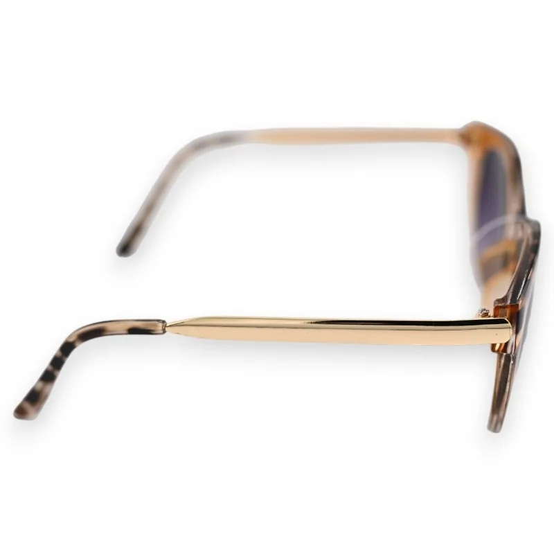
Flat gold arms run back to speckled tips, so the print turns up twice, once above the eyes and once behind the ear.
Two things fade from top to bottom here, and they fade together. The front goes from spotted tawny down to a near-transparent lower rim; the lenses go from a deep tint at the brow to a paler one underneath. The two read as one movement rather than as two separate ideas, which is why the pair looks calmer than a print this bold usually does. If you want to see the proportions against something else, here are the chunkier fronts kept on the same shelf.
The tint is darkest along the brow and thins out towards the bottom of each lens. That matters most when you drop your eyes rather than lift them: a phone, a menu or the kerb in front of you is read through the palest part of the lens, never the deepest.
From the side the arms are slim flat gold blades, and the contrast with the wide front is the whole point: a heavy front on thin arms looks lighter than the same front on thick ones. The blade stops well short of the ear, and the last stretch is a speckled tip, which is also the only part of the pair that sits against your skin.
| Front | Spotted tawny above, clear and translucent below |
|---|---|
| Lenses | Graduated tint, strongest at the brow |
| Arms | Flat gold-tone blades, straight to the temple |
| Tips | Speckled beige and black, carrying the print on |
Tawny and black sit easily with camel, off-white and raw denim, and the clear half asks for nothing at all, so a plain shirt is enough. If you like the print echoed rather than repeated, a printed square in the same warm tones does that job at the collar.
Data sheet